Climbing down from the fossil peak?
A short review of long-term energy forecasts
TLDR: Looking across a range of both base-case and policy-driven forecasts, the long-term debate on coal is the timing of peak demand; the debate on gas is whether there will be a peak at all (or at least before 2050); the debate on oil is whether the peak is followed by a cliff or a plateau.
Kingsmill Bond, the RMI energy analyst, is out with a new deck, titled The Cleantech Revolution, laying out some of the key themes of the energy transition to date and his team’s predictions for the decades to come. Bond and his team are great at “the visual display of quantitative information,” and the presentation is full of virtuoso charts. The energy transition story, in their view, is one of an imminent peak in fossil fuel demand, and exponential growth in deployment of the technologies that will make it happen - in particular, solar panels, stationary batteries, and electric vehicles (EVs). I think they are directionally right on the big picture - that there are changes in how industries behave when they tip over from linear to exponential growth, and, conversely, from slow growth to no or negative growth.
An implication in the RMI report is that scenarios that are explicitly solving for an emissions threshold, like BNEF’s “Net Zero Scenario” (NZS) and “Economic Transition Scenario” (ETS), or Rystad Energy’s 1.6C and 1.8C pathways, might be more reliable than forecasts that remain anchored in current policies and technology trends. I note that nearly all the forward-looking graphs and charts cite prescriptive scenarios from modeling shops that explicitly disclaim that they are descriptive predictions. A slide toward the end of the report warns “incumbent modelers” (ExxonMobil, OPEC, and the US EIA) to update their methods or risk becoming “stranded experts.”
It’s a provocative point, and one made maybe a bit too strongly. Something like the EIA’s Annual Energy Outlook is inherently a status-quo modeling effort, extrapolating from recent trends, rather than an attempt to calculate the most efficient way to solve for a given level of greenhouse gas (GHG) emissions. Both kinds of modeling are useful, but they are designed to do different things. Bridging the gap between these two ways of thinking about the future is one of the big challenges in climate communications.
(RMI)
As I’ve written about before, a wide range of different groups publish long-term energy outlooks, from oil companies and for-profit research shops, like BNEF and Rystad, to international organizations, like the IEA and OPEC. Some of these logos are on the RMI chart above. I think the value of these forecasts is most apparent in the aggregate. Comparing different projections for fossil fuel consumption helps spotlight where there is disagreement among energy modelers.1 Disagreement on the timing and level of peak demand for coal, gas, and oil, and how long that demand plateaus before starting to meaningfully decline, ultimately means disagreement on the future level of emissions, and from there, the level of atmospheric CO2, the probability of exceeding a certain level of global warming, and the various negative downstream effects that follow.
To the extent modelers disagree because the actual range of outcomes is very wide, benchmarking how they differ highlights the “swing factors” that make the difference between a low-3C world (where we are headed) and a low-2C world (the trajectory we may be on by the end of the decade, with a few lucky breaks). I charted a mix of policy-driven scenarios, which show how the world might converge on a net zero pathway, and base cases, which are trying to make a forecast. Each chart below shows the projected change in primary energy use by fossil fuel over three time horizons - 2023 to 2030, 2030 to 2050, and 2023 to 2050. Policy-driven scenarios are the columns on the left of each graph, and base cases are on the right.
(Various)
The variance across scenarios boils down to:
(1) The timing of peak demand and post-peak rate of decline for coal. In policy-driven scenarios, coal consumption, measured in primary energy terms, declines from ~15-40% by 2030, averaging 28% across scenarios. Across base cases, it either declines from 5 to 12%, or, in the case of the Shell Archipelagos scenario, grows 2%. The base case average is a 6% decline. Coal represents ~15 Gt of run-rate emissions, so the difference between a 6% decline and 28% is ~3.4 Gt of emissions.
Notably, all the scenarios but one agree that coal demand will peak this decade - the debate is on the timing of the peak and the magnitude of the decline to follow. A large majority of global coal consumption (68%) is in China, India, and Southeast Asia. These regions made up more than 100% of the growth in global coal consumption from 2010-2022, i.e., in the rest of the world, coal consumption declined by 25%. I think it’s possibly to simplify even further, and really focus on developments in China over the next few years.
The near-to-medium term direction of Chinese coal consumption is ultimately about (i) which industries, in which parts of the country, are generating the incremental dollar of GDP, which drives growth in electricity and industrial heat demand; and (ii) whether low-carbon resources (hydro, nuclear, solar, and wind) are growing fast enough for growth in clean generation to catch up with growth in power and fuel demand.
Using rough numbers, China grew generation by ~400 TWh a year over the last ten years. On today’s base of ~9,500 TWh of electricity supply, this represents a little over ~4% annual growth. Solar generation, which is a little under 4% of supply, is growing nearly 30%, while wind, which is nearly ~10% of supply today, is growing at around 15%. So, simplistically, solar and wind alone can offset ~2.5-3.0% demand growth. If we add on ~6-8 GW of nuclear per year, at a 90% capacity factor (in line with current policy goals) and ~15 GW of hydro (in line with the historic rate of capacity additions), at a 40% capacity factor, that adds an additional ~1% per year to growth in total generation.
So we are clearly very close to peak coal power burn in China - when exactly that happens depends on demand (which in turn depends on near-term trends in industrial output) and whether renewable deployment - especially for solar - can accelerate even further.
(National Bureau of Statistics of China)
(2) Whether gas demand peaks soon or never. In all but one of the policy-driven scenarios I compared, primary energy from natural gas peaks and starts to decline before 2030, with the rate of decline ranging from -16%, in the IEA’s Net Zero Emissions (“NZE”) scenario, to -1.6%, in the BNEF NZS. Conversely, the base case scenarios project growing gas demand, anywhere from +3% in the IEA’s base case to +10% in the (typically bullish) OPEC forecast. Gas is responsible for about ~7 Gt of CO2 emissions, so the difference between the average estimate across the policy-driven scenarios (-6%) and the base cases (+6%), is about ~850 MT of emissions.
In one sense, that means the gap between the policy-driven and base case models is much less significant than the gap between their estimates for coal consumption; only about a quarter of the emissions are at stake. But the tension between each camp on gas almost reflects a deeper divide - not just on the magnitude of the change in consumption, but the sign. It’s striking that the base case modeling approaches predict a similar level of growth in gas consumption from 2030 to 2050, at around 5%, though obviously at a much slower annualized rate, and with a lot more variance, from Shell Archipelagos at -13%, to OPEC, at a whopping +21%.
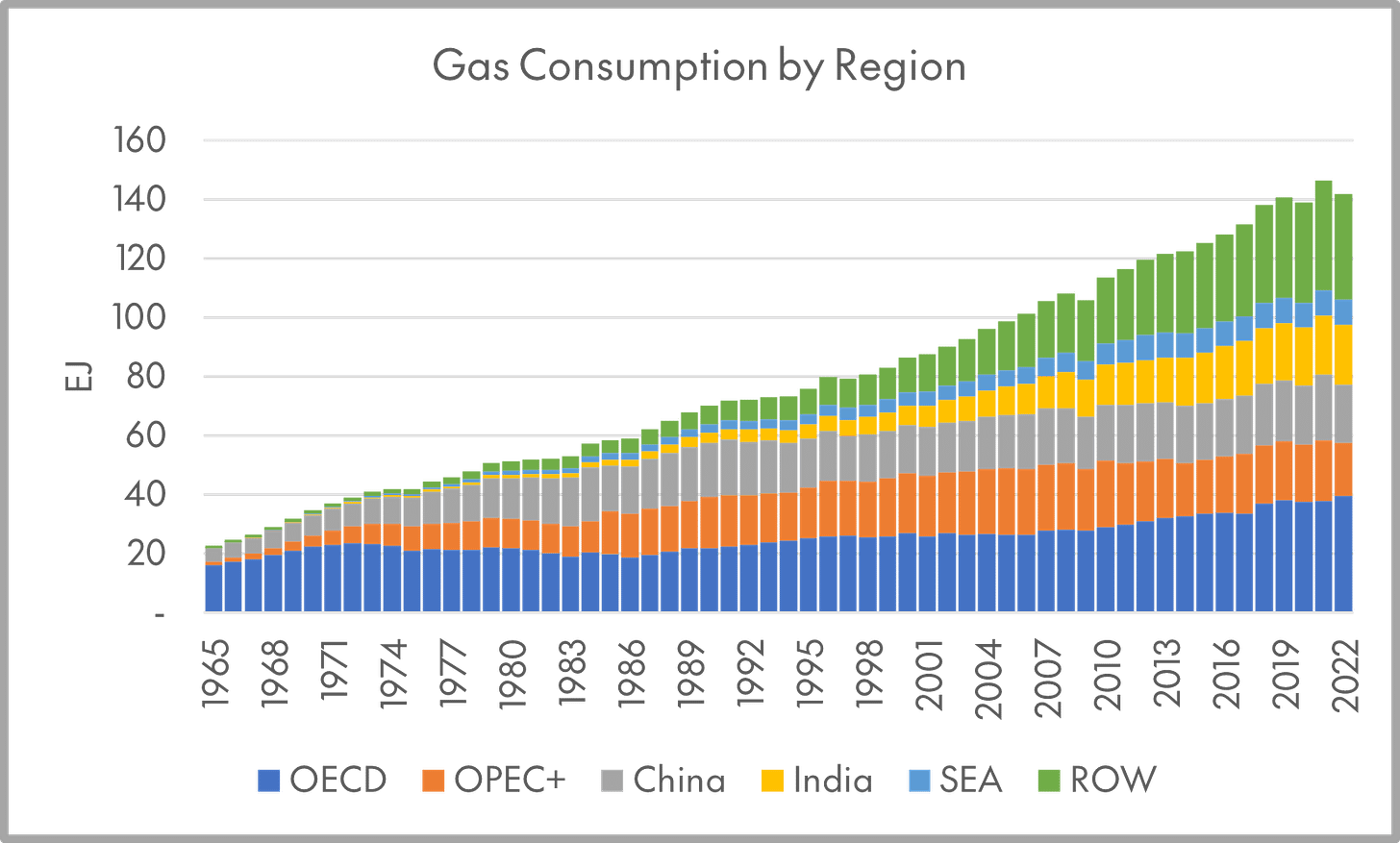
Natural gas, like coal, is primarily thought of as a fuel for the electric power sector, but is also widely used to keep buildings warm, and as a heat source and feedstock for various industries. But while the prototypical user of coal is a fast-growing, middle-income country, the geography of gas consumption is very different. Over 70% of natural gas is used by OECD member states or members of the OPEC+ cartel. These countries have also been the marginal consumers of gas in recent decades, as the second chart below shows, driving most of the change in gas use in a typical year. The timing of peak gas - and whether it’s followed by a plateau, or a steep decline - is really about power burn in the OECD. These are countries where policymakers are pulling trade, tax, regulatory, and public investment levers to build up various low-carbon industries - but where it remains to be seen whether low-carbon, dispatchable resources or more natural gas capacity will answer the call to “electrify everything.”
(Statistical Review of World Energy)
(3) Whether oil demand peaks or plateaus in the early 2030s. Except for BP’s New Momentum scenario, the base case models I’ve looked at all show a healthy level of oil demand growth between now and the end of the decade, ranging from 3% for the IEA’s Oil 2024 report, to 11% for OPEC. Conversely, the policy-driven scenarios all project a peak before 2030, except for the BNEF ETS. Across all the scenarios, the base cases project an average of 4% growth between now and 2030, while the policy-driven cases project an average of 7% decline. Oil produces about ~12 Gt of CO2 emissions per year, so that gap represents a roughly ~1.4 Gt range of emissions outcomes.
Base case modelers generally envision gas demand continuing to grow after 2030, at a slower rate. Gas is valued as a “transition fuel,” that, especially with carbon capture and storage (“CCS”) is seen as a potential rival to battery storage, demand response, and power-to-fuel cycles (i.e. hydrogen) in providing clean, on-demand power in a (mostly) decarbonized energy system. On the other hand, all the base case modelers, except for OPEC, see oil demand declining after 2030. The difference between the base cases and the policy-driven scenarios is whether that decline is modest - a plateau rather than a cliff - or rapid.
Products used mainly for transportation fuel make up around 60% of oil demand. Products used mainly as feedstocks for chemical production (ethane and naphtha) make up another 22%. Everything else, including fuel oil, makes up around 18%. Long-term gas demand is obviously exposed to the risk of higher-than-expected EV penetration, and oil products used for heating are exposed to the risk of substitution with gas boilers, heat pumps, and the like. Arguably, some portion of long-term plastics demand is threatened by the possibility of global single-use plastics regulation. But there are not yet commercially viable alternatives for most of this pie chart.
One way to frame this is that from the perspective of an owner of fossil fuel assets, or a country dependent on fossil fuel exports, is that more of gas demand is at risk of substitution with low-carbon alternatives for power and heat, but the rate of substitution is limited by grid intermittency, the interconnection queue, transmission chokepoints, etc. Less of oil demand is threatened by already-viable technologies, but the magnitude of the threat is greater and likely to play out on a shorter time horizon (since the passenger car fleet turns over 3-4x faster than the global power generation fleet).
(IEA)
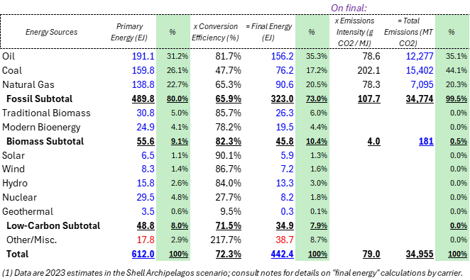
Appendix: Global Energy by Source
I would highlight Resources for the Future’s Global Energy Outlook project, a tool for exploring harmonized data points from various energy forecasts,


